Typography and graphic design have played an enormous role in disseminating and promoting truths and untruths alike for centuries. Design and type were used for both anti-slavery pamphlets and broadsides, AND for posters announcing the sale of enslaved persons in the early 1800s. Intricate and exciting letterforms were utilized in propaganda of all kinds during WWI and WWII—to promote war efforts, to beg for peace, and to demonize the humans “on the other side” of the battle. Protest movements and activists around the globe rely on signage consisting of letterforms and symbols to quickly (and pointedly) share their messages with the world. Social media platforms are full of typographic quotes and memes that make sharing information (and dis- and mis-information) lightning fast and easy. Typography and design can be used to make a message appear more trustworthy, more official, more friendly, more authentic—despite the original source or intention.
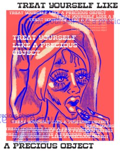
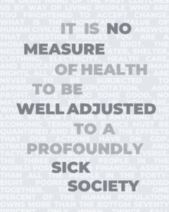
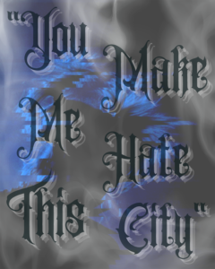
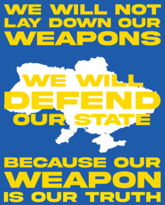
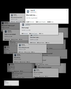
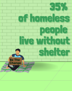
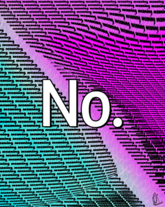
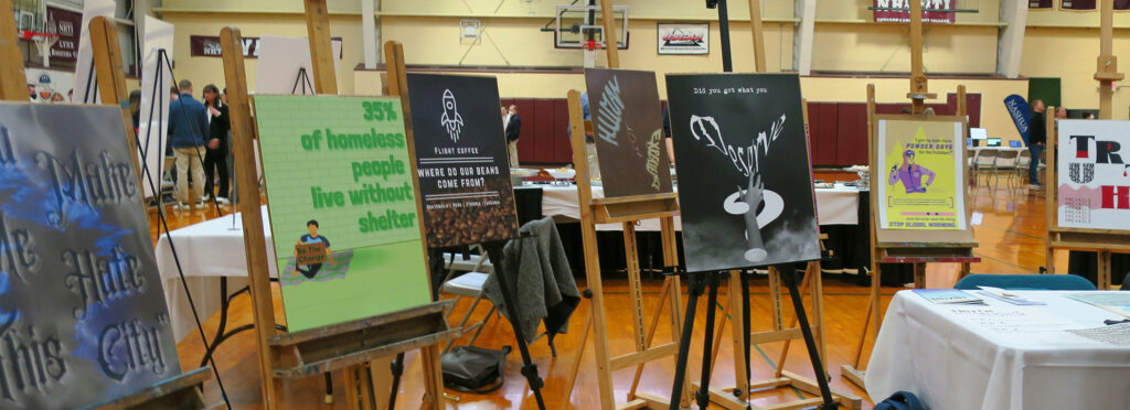
For this project fifteen students in ARTS 610 Principles of Typography researched, examined, and analyzed poster designs—both historic and current examples—and then created or chose a message connected to their own ideas about truth or the depiction of truth. Students used these messages to design the posters you see here.
Truth can be an uneasy and complex discussion because reality and perception are deeply embodied, rooted in an individual’s lived experience, and incredibly contextual. This is not only true for the content and message of a design work, but is also highly dependent on the form and format—the aesthetics—of the design. As humans, we often find ourselves pulled by a specific color, font, or kind of image, and use those cues as shorthand to help us quickly make decisions—we can be so easily swayed or seduced by what something looks like. This is the power of design and why discussions of ethics are so crucial to the training of designers AND those who consume the things designers make.